Background
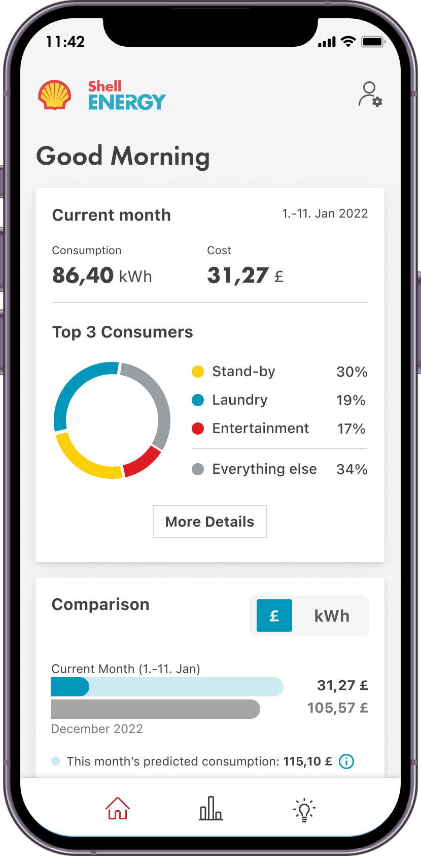
When I joined the European Toyota App team, Toyota was investing heavily in EV technology and launching a new energy management area within the app, designed to help users understand, control, and optimise energy between their car and home.
As Lead Product Designer, I owned the end-to-end experience, from discovery and research through to flow design, stakeholder alignment, and testing.
Team SetupThe work was happening within an established team structure and delivery culture that really pushed for "just implement it." My role became not just about redesigning the experience, but also introducing stronger design thinking and more realistic delivery talks, often directly with senior stakeholders at Toyota.
- Optimise vehicle charging costs with a seamless EV charging experience
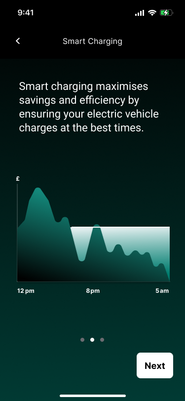
- Educate users about the benefits and capabilities of V1G technology
- Develop user-friendly interfaces for Smart Charging controls that accommodate varying energy needs and preferences
Understanding Users
The feature needs to work for current Toyota EV owners already using Smart Charging, new EV owners just learning about the concept, and future users of upcoming technologies like Vehicle-to-Grid (V2G). To understand expectations, behaviours, and mental models, I worked with a UX research specialist to interview both EV owners and non-EV owners, supported by a detailed questionnaire.
- Users primarily cared about how much charge their vehicle has
- Cost of charging was the second priority
- Users expected to access and manage this information easily from their smartphone
Uncovering Ownership Gaps
In parallel, I also surveyed internal stakeholders to understand how the feature had evolved, who owned which parts of the experience, and where handoffs were breaking down. It became clear that multiple teams owning different components had resulted in a loss of journey fluency for the user.
Fragmented Experience and Discoverability
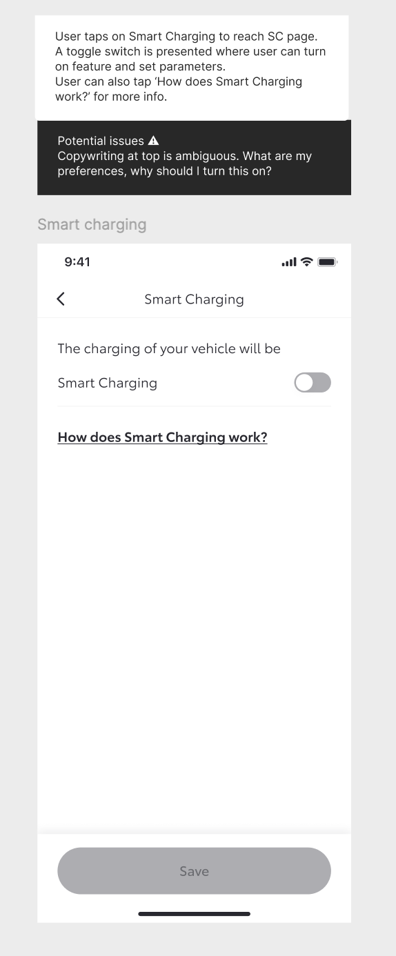
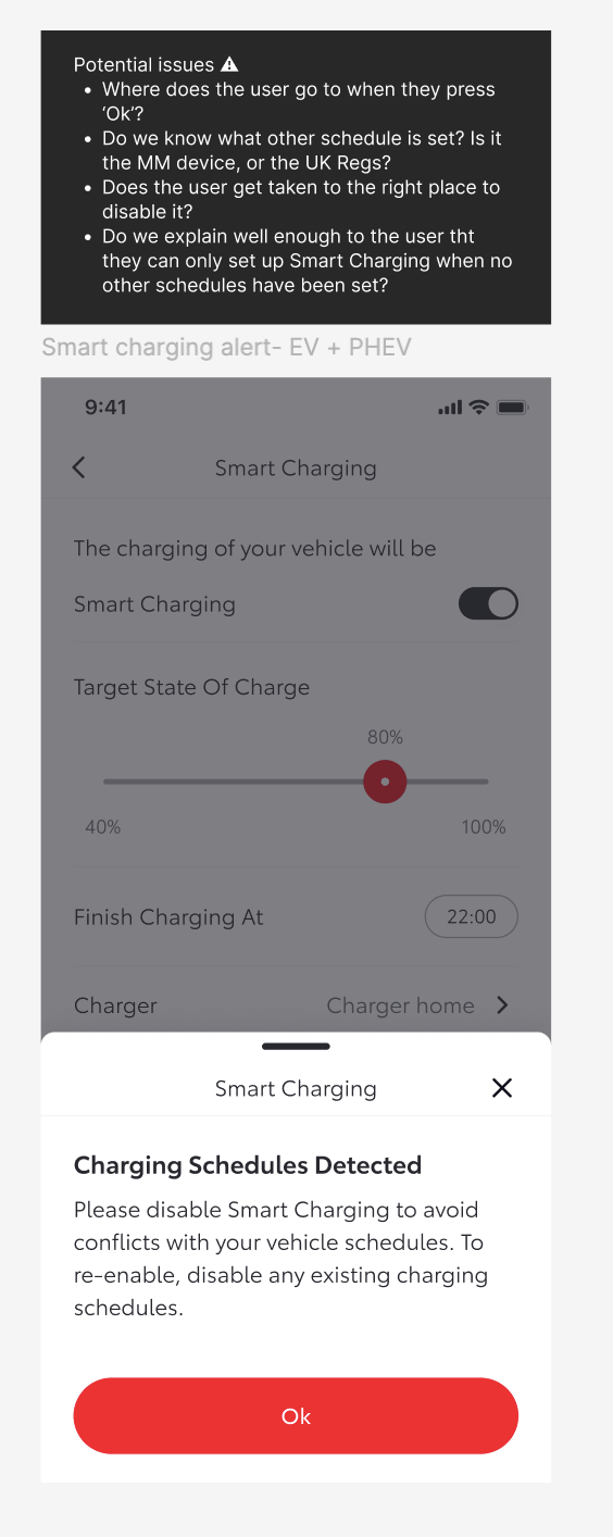
A heuristic review I then conducted showed that Smart Charging was deeply buried in settings with no explanation of why it was worth using. And when users did find it and tried to turn it on, they were hit with multiple pop-up windows, this was a side effect of technical constraints that needed resolving before scheduling could activate. Confusing and frustrating.
Learning from Competitors
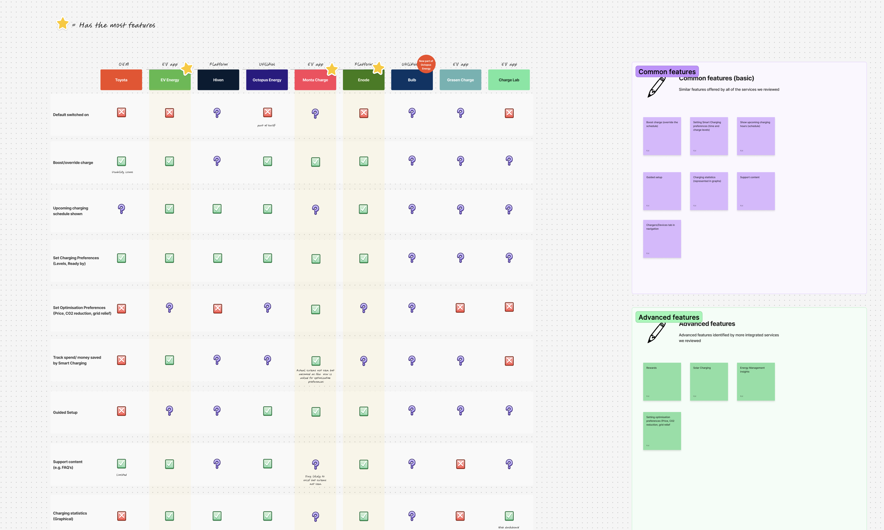
I reviewed competitor apps to understand how Smart Charging was explained and framed, how setup journeys were structured and which features were considered baseline expectations. I then mapped these into a feature comparison, identifying must-haves, nice-to-haves, and gaps in Toyota's current offering.
Some clear themes emerged that showed which features were essential:
- A guided setup flow
- An override option to charge immediately
- Charging statistics, usually visualised in graphs
- Visibility of upcoming scheduled charges
Most of these were missing or poorly implemented.
Fixing the Core Problem
Rather than layering improvements on top of a broken experience, the focus shifted to fixing the fundamentals.
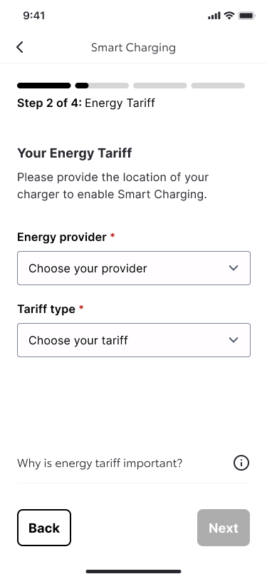
The feature needed to be visible, signposted more clearly in the app for EV users, with benefits explained using language that reflected the top user priorities mentioned above: charge level, cost, and control. Most importantly, the feature setup needed to feel simple and linear. I designed a new guided setup flow that walked users step by step through the process.
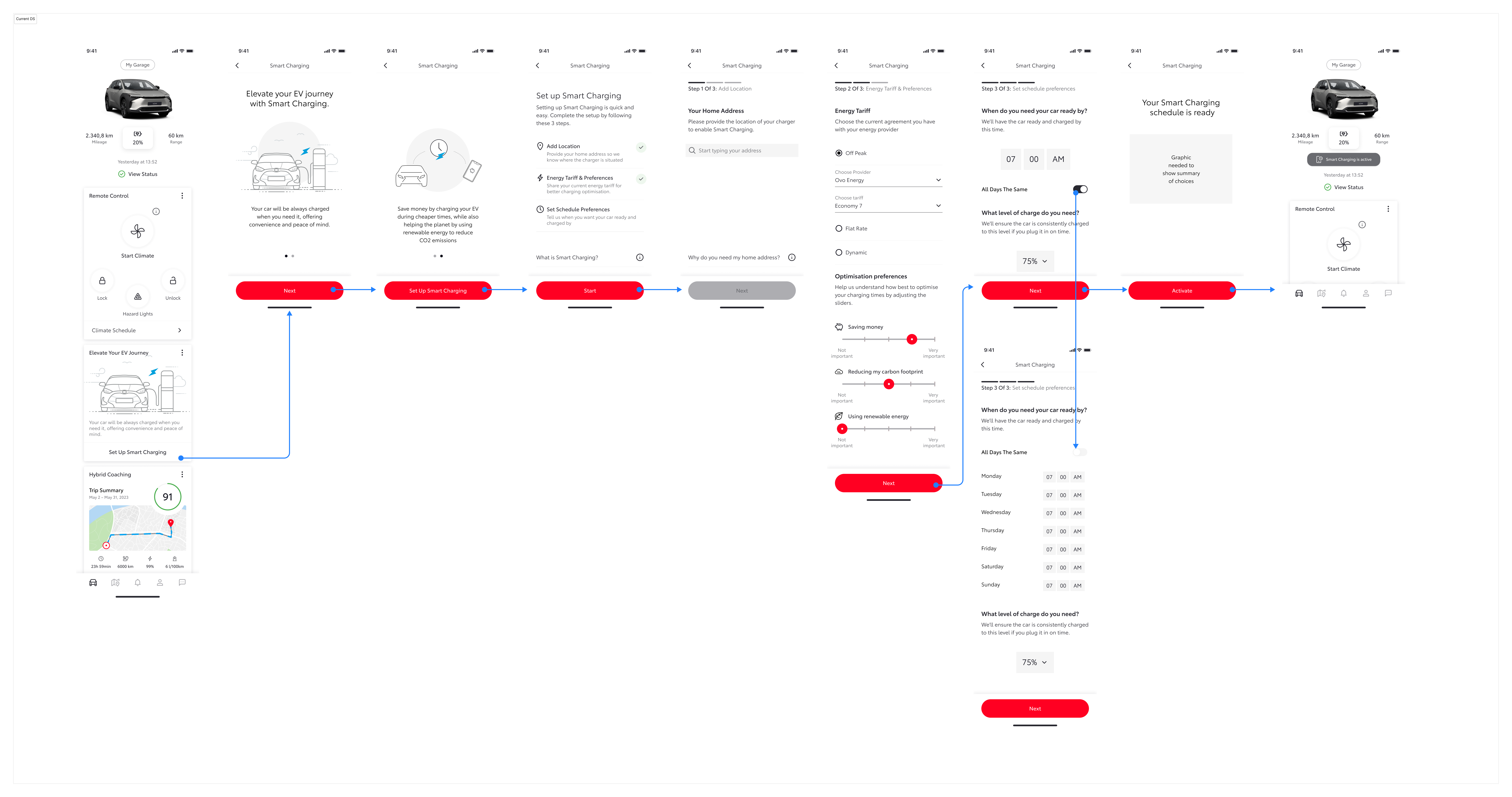
Proposed flow
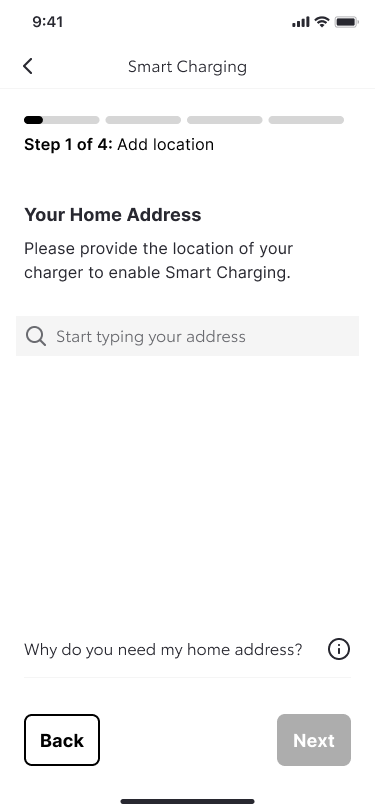
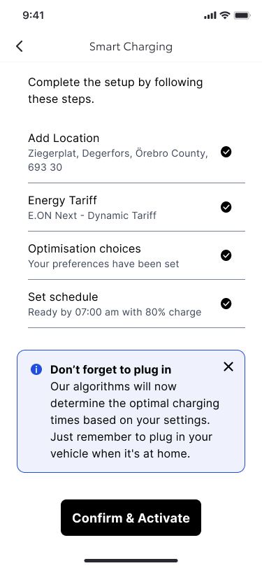
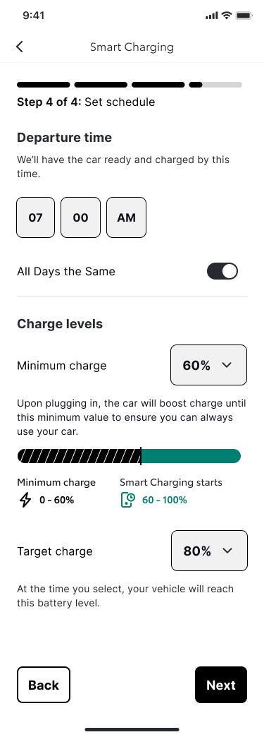
Some of the same screens but using the new design system being created in parallel by the wider design team
Testing and Early Outcomes
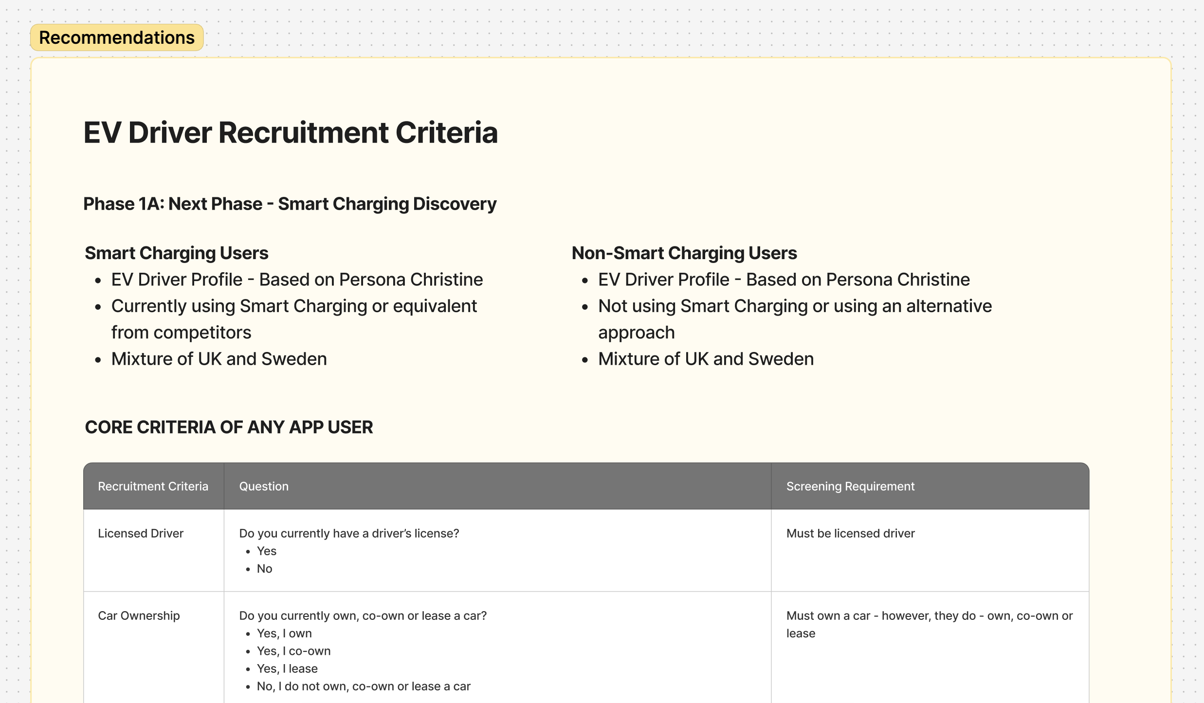
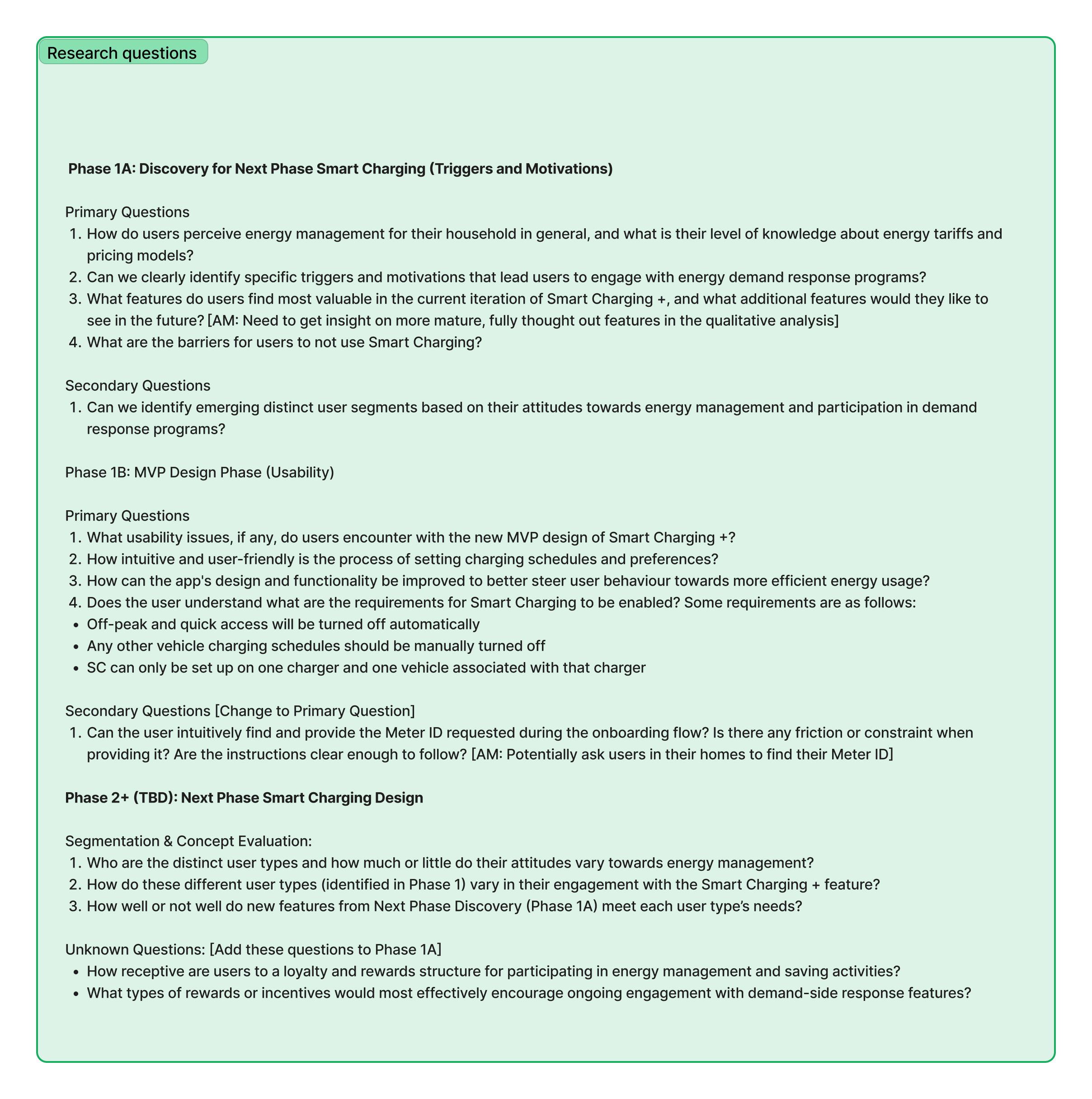
The redesigned journey was prepared for launch in the UK and Sweden, where Toyota was partnering with local energy and services providers. User testing focused primarily on UK users and the participants were guided through the new setup experience and prompted to let us know things like missing information, any points of confusion, and any moments of reassurance or uncertainty.
Results were documented in detail and presented back to stakeholders, helping align product, engineering, and leadership around why the changes mattered, not just what had changed.
Impact and Next Steps
While this work was completed ahead of launch and did not yet have live performance data, user testing showed a significant improvement in understanding and confidence when setting up Smart Charging. The redesigned journey also helped align product, engineering, and leadership around a shared vision for energy management.
Broadening the Scope After Smart Charging
Smart Charging (V1G) is just one part of a much bigger energy management piece around charging capabilities between the car and the home. To explore this future state, I worked closely with a Service Designer to define a long-term vision for Toyota's energy management experience. Together, we mapped out how this could all come together into a single, coherent narrative.
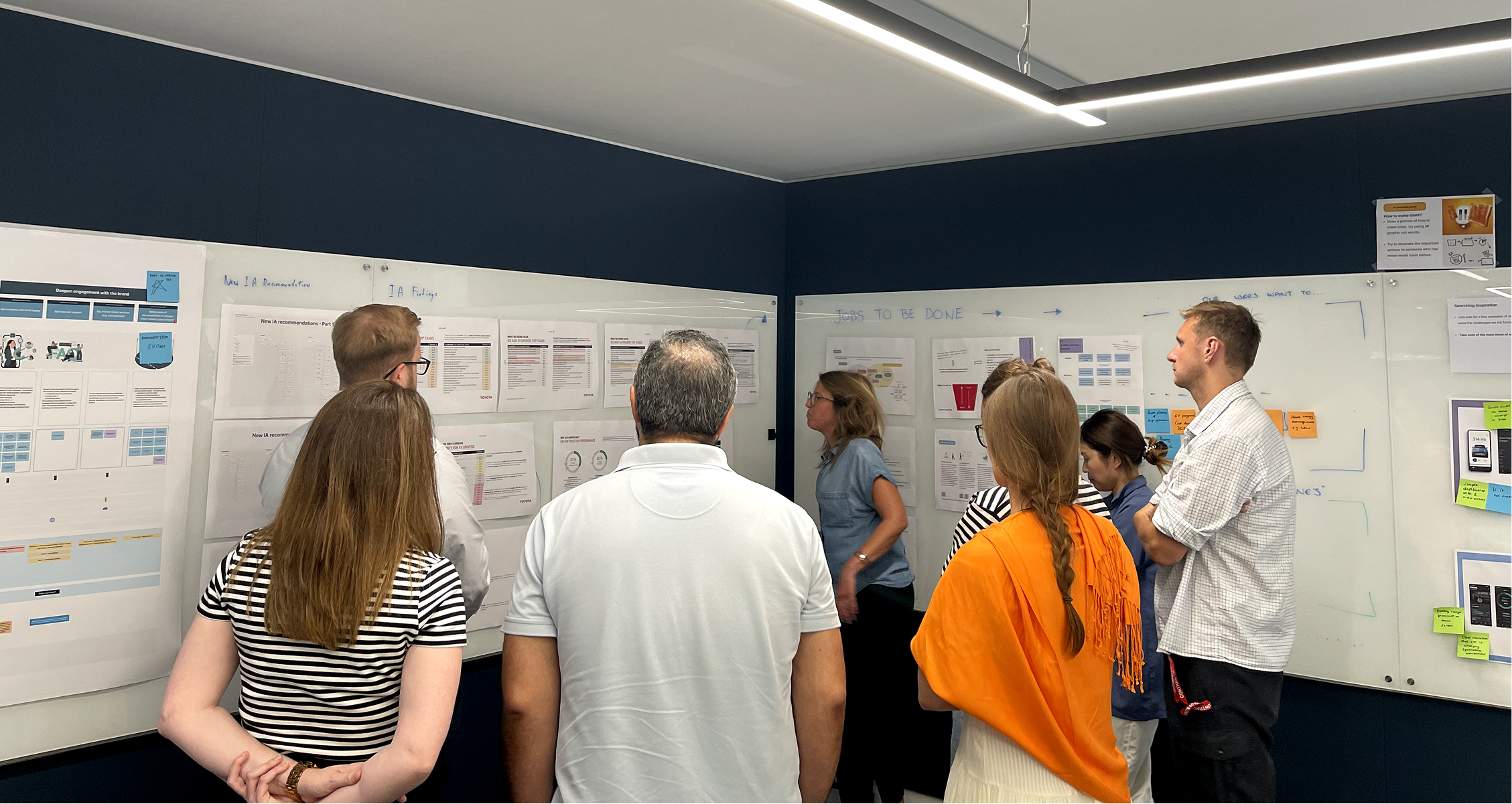
Image of a team workshop that myself and the EV team organised and facilitated.
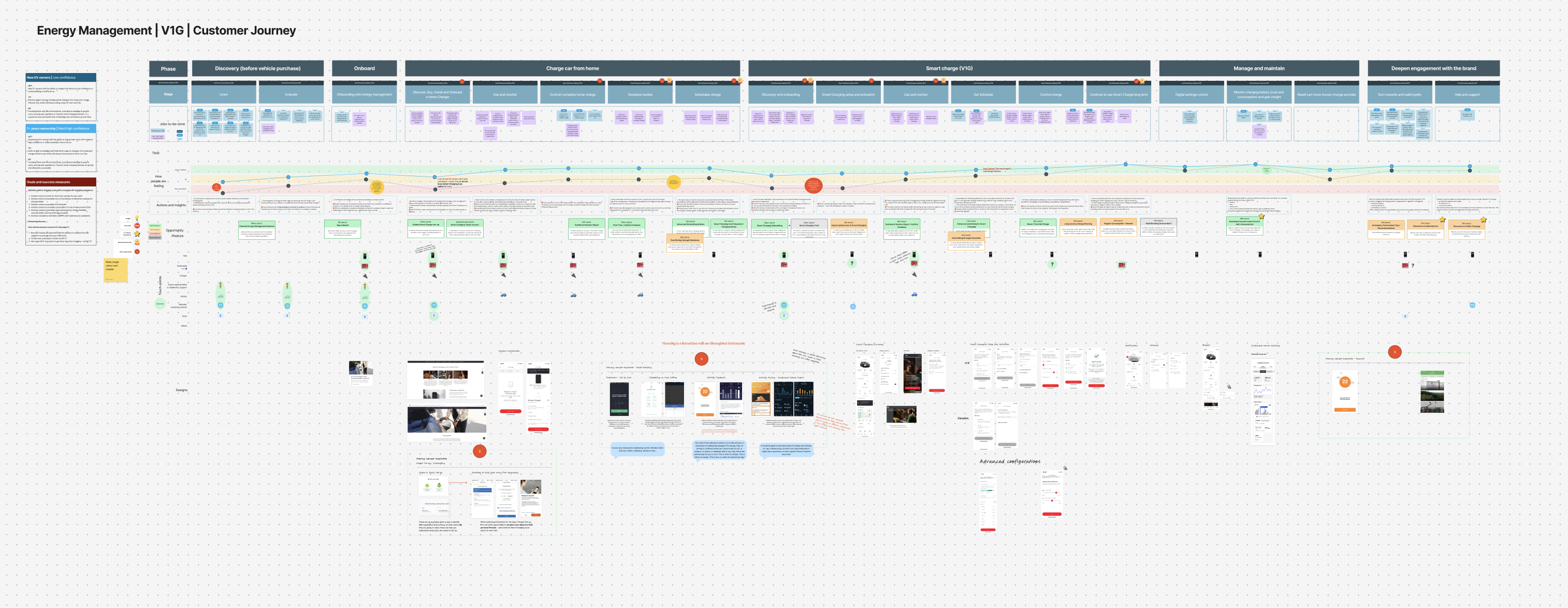
A customer experience map that the service designer and I co-created
The Moments That Mattered
-
Slowing down to move faster The team culture pushed hard for immediate delivery. One of the most important decisions was advocating to pause and properly understand the problem first — running research, doing the heuristic review, and mapping the full journey before a single screen was redesigned. It wasn't always a comfortable conversation, but it led to a fundamentally better outcome.
-
Pushing back with evidence, not opinion Stakeholders weren't used to being challenged. Rather than presenting opinions, the approach was to let the research and heuristic findings do the talking — framing pushback around user impact and business risk rather than design preference. That shift changed the dynamic of stakeholder conversations.
-
Designing for now and for later Smart Charging was the immediate brief, but designing it in isolation would have created more fragmentation down the line. A key decision was to collaborate closely with a Service Designer to align the near-term work with a longer-term energy management vision — so the V1G work wouldn't need to be undone when V2G arrived.
-
Cross-design alignment as a foundation With multiple teams owning different parts of the experience, aligning with other designers on a shared vision was non-negotiable. Without that, each team would continue building in their own direction.